Table of contents
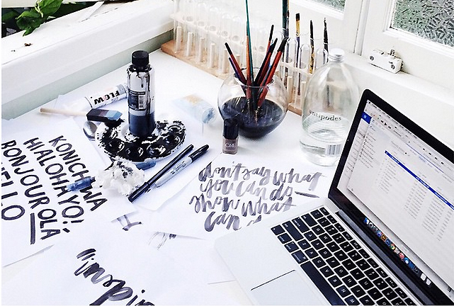 Do you know what the best font for an outstanding resume is and what fonts drive the employers crazy? Fortunately, resume editors know everything about the most suitable format and know you have a chance to get the secret of the killer summary!
The importance of a suitable typeface is obvious – it creates a readable document and shows that you are familiarized with the tiniest peculiarities of the job search process. In this article, you will find everything about winning and the worst variants for your resume!
We are going to start with the absolute winner, the font that will be accepted by every employer. The benefits of this typeface lie in the business orientation and the classic simplicity of this font.
Most of the reputable experts claimed that there is no better font for the resume than Helvetica. Some of them, still, don’t consider it to be good for creating jobs but it’s always a good choice.
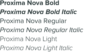 Proxima Nova is another suitable font, which keeps up with Helvetica. Helvetica, though, is more solid and Proxima Nova is a little bit softer.
The experts, who helped us to create this article, claim that they haven’t met anyone, who wouldn’t like this typeface. The only disadvantage lies in the cost. You can purchase Proxima Nova at $29.99 on MyFonts.com.
This typeface is good for everyone, who has a lot to say. It’s good either for a resume or for a CV. Don’t forget to learn about the local peculiarities of the job search and the differences between resume and CV. Garamond helps to create a readable resume. Assuming the fact that readability is an important factor, Garamond is a good choice.
The opinions of this typeface are the most uncertain. Some of the experts consider it to be old school. They think that using Times New Roman shows that a candidacy didn’t even take a time to choose a font. Sometimes details speak louder than usually.
Still, some of the experts think that a classic font is a good option. We can’t force you to use or not to use it – the choice is up to you.
The other controversial font is Didot. Generally, it is used by women and looks a little too fancy. It isn’t suitable for executive or IT jobs. Still, it’s really suitable for fashion positions. This is the type of font that requires an appropriate situation.

We have moved to the typeface that mustn’t be used in the resume or cover letter. It looks too familiar and can be used for your party or wedding invitations. Furthermore, you mustn’t use anything that is similar to Zapfino. Some experts say that it’s even better to use Times New Roman – classic and modest font.
Also, make sure your resume is created in accordance with the job description to guarantee your career success!
The other typeface that mustn’t be used for a summary is Courier. In fact, it mustn’t be used anywhere. The other old-school font is similar to the typewriter.
Did you use a typewriter to produce your resume? Obviously, you didn’t. Therefore, apply to the aforementioned fonts and use one of them for the document!
Comic Sans doesn’t require any explanations, we guess. Still, we should emphasize that you must never in your whole life use Comic Sans, even if you just write the draft. It’s ridiculous and unprofessional, thus, you should avoid it, especially when it comes to resume writing.
The other actual issue is emoji. Should you use emoji in your resume? It’s a complicated question and the answer depends on the situation. On the one hand, it’s a fresh and plucky step that can show your creative and outstanding mind. It can be your logo after all! On the other hand, you should be cautious about using cute emojis.
A person, who applies for an executive-level position, should think twice before using it in the summary, we suggest that more often than not it is inappropriate to use emojis in communications at work.
A resume format is a crucial moment that can make a killer resume. Therefore, don’t underestimate the role of quality formatting and make a substantial step to your successful career.
There is no right answer to this question. Each job seeker has his own preferences regarding the CV font. The major criterion, however, is the high level of readability that does not distract recruiters from the CV content. Here is the list of the best fonts to use:
Arial. This one may not be considered the best CV font but it creates very clean and easily readable text and that is why Arial is being used by many job applicants in their applications. Most of the career experts and HR managers, though, consider Arial neutral and even banal. Obviously, it’s not the reason why a CV gets rejected but why not choose another? Herewith they call it a “safe bet” for people who stick to classic and standardized resumes and those who don’t want to risk.
Calibri. Just like Arial, Calibri makes a perfect match for people who like keeping it safe. Calibri will definitely become a good CV font choice for Microsoft Word Curriculum Vitae since it’s familiar to most people working on computers. By the way, according to professional CV writers, Calibri creates a perfect CV font size so you can perfectly match 600-700 words in a two-page CV.
Times New Roman. Even though it is widely used in resumes for a very long time because of its professional look, many HR managers admit the era of Times New Roman has come to an end. Now, CV written in this font is no longer impressive and they lack originality. As a great alternative to Times New Roman, it’s better to use Georgia.